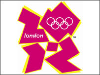
As the debate rages on about the Olympic logo this is Mr L's letter to the Guardian:
Dear sir / madam
Instead of the traditional vilification of anything different (Edgy symbol of digital age or artistic flop, 5/6/07) the London 2012 team and their brand designers should be applauded for having the courage to create a brand that is truly innovative and unique in the sterile field of corporate Olympic designs.
Leading edge design often makes us uncomfortable at first, particularly if we are outside the main target group. This brand is explicitly aimed at young people, who have been marginalised by previous Games and are almost certainly not to be found voting in online petitions or frequenting the comment pages of the traditional media. Maybe they do have reservations themselves, but none of those opposed to the brand seem to have thought it worthwhile to ask for their opinion. This may prove to be the greatest justification of all.
Sadly, the only thing more predictable than the rush to condemn will be the scramble from the same people to jump on the acceptance bandwagon in a year’s time, when the new brand is a showcase for London as a continuing leader among world cities - brave, bold and embracing change.
Yours faithfully